Exhibition
Wednesday, 13 April 2011
Conclusion
I am also pleased with my contribution to the exhibition. At first, although I got involved with the profile photos and the creation of the content of the website, I felt my contribution wasn't all that great. But I sourced display boards for the exhibition although they were not needed in the end and I created the badges for the uniform.
Tuesday, 12 April 2011
Thursday, 7 April 2011
Personal Profile Information
I am currently a university student studying a BSc in Multimedia, Animation and the Web but before that I successfully ran my own business for six years.
While at university I have become really good at using a wide range of Adobe programs like Photoshop, Flash and Premiere Pro. I also can use CAD programs like Auto Inventor, Sonar, 3D Max and write HTML, CSS and ActionScript and I am currently learning JSP which I am really enjoying.
I also really like usability and interaction design which I have based my dissertation on.
I am also into creating animations, particularly 2D animations using Flash and a piece of my work I did at university has been selected to enter an animation festival.
After I graduate I plan to start a career in design, hopefully where I can use my usability design and coding skills.
Exhibited Work x3

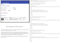
Web Application Development
The aim of this assignment was to create a website application for a timeshare company called InterHol that could achieve certain tasks.
The InterHol website had to allow the user to login, search for holiday properties by either by country, ID number or week availability, make a booking and edit their own holiday properties. Also an administrator login would allow administrators to view all the holiday properties registered with them and their booking status.
This was completed using JSP liked to a Microsoft Access Database though Java and Apache Tomcat.
Exhibited Work x2

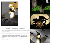
Visit Essex
In this project we worked with a client to create an advert for Visit Essex to encourage visitors to Essex.
Working in groups we came up with a concept and between us created a three minute advert. Our concept was “little England” as our client said she received many comments saying that Essex included everything typical with England.
The models were created in 3D Studio Max which included a canal boat, lock, lock house and surrounding area. The animation was also done in 3D Max and the video editing was done in Adobe Premiere Pro.
Exhibited Work x1

Design Methods and Technological Project
The aim of this assessment is to develop a product from inception through to completion. This was done by researching into standards and patients, completing market research and then creating a prototype.
The product I developed was a barcode scanner that people could use while shopping to calculate the total number of calories and other nutritional information of the food they were buying. While doing research it was clear that while people knew the importance of eating healthily, many people lacked the knowledge to do so. While researching into patients I realised this was an original idea.
The concept and technical drawings were created using Auto Inventor while the interface prototype was created using Adobe Photoshop while the workings were created using Adobe Flash and ActionScript 3.0
The interface allowed the user to select how many people they were shopping for and how long the food was going to last them. The barcode scanner then added up all the calories, protein, carbohydrates, fat and sugar and displayed them on an easy to understand graph. It also allowed the user to make the scanner avoid certain foods in case the user is a vegetarian or allergic to any foods.


